Painting - Translation: Van Gogh's Starry Night Over The Rhone to Jackson Pollock / Jean-Paul Riopelle
For this final assignment, we were tasked with taking a certain classical style painting, and translate it to a more modern art movement style. I picked Van Gogh, but instead of doing the famous 'Starry Night', I chose a slightly (barely) more obscure one called Starry Night over the Rhone. Taking that painting, here's my process of making it into an Abstract Expressionism, similar to Jackson Pollock or Jean-Paul Riopelle
Read on:
Blank Canvas, hard to tell scale here, but this piece of stretched canvas is 38 x 24. So much potential, just waiting.
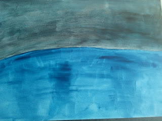
Laying the foundation layers of paint. The top layer is an azurite blue, the bottom is a Prussian blue. My classmate comments "that's a great looking sunrise over a lake!". Not what you really want to hear when you're painting a starry night...
Began adding some black overlays to the sky, definitely moving more into the realm of nighttime.
More black highlights, and mirroring the dark shadow elements into the water. Can't have one darken without the other right?
In abstract expressionism style, adding some shadowy tears in the sky. Perhaps riffing off some Clyfford Still in this. Feeling that these choices are decidedly timid however.
Added a terra green for the pier. Not happy.
Ignoring the terra green of the pier and turning to do more work on the stars themselves. Utilizing a technique of trying to make it look like the 'stars' are ripping through the page. Still not happy with the green. Added a reflective tone to the surface of the water, darkened it considerably.
Began etching in the city. Suddenly decided the whole thing looks very cartoonish, not pleased.
Pivot moment, in true abstract expressionism style, I took about a tablespoon of q.red on my palette knife and just carved it right into the canvas. What follows is an hour of frenzied knifing of colour into canvas.
Pollock would be pleased...maybe.
Blues, violets, greens...everything goes into the water. Whites and blacks too.
A key moment, the sky no longer translates well, it is still cartoonish and flat, without depth. Some cobalt blue and white fix that problem, we begin knifing these in as well.
The finished painting, with a knifed-in yellow for the reflections of the city over the water. All in all, quite pleased...may go back at some point and do some corrective work on the city itself, but happy with the result.
Thanks for checking out my craziness.


No comments:
Post a Comment
Comments may be screened for content.